Designing Our Logo
Recently, we've been working on the homepage for The Collective, which naturally entails needing graphic design assets. We've been hard at work fleshing out the site with a status page, our git repository, and much much more... but a homepage felt the most important.
We're excited about the future here at The Crow Collective. It sure feels bright with so many possibilities open to us. We could release new music, maybe write a photo essay, potentially even make a game? There are so many options that it felt good to have one thing to focus on.
Anywhos, on to the meat and potatoes. In this post we will be discussing the how's and why's of the choices we made with the design. Keep reading to learn more about our logo!
Design & Development Methodology
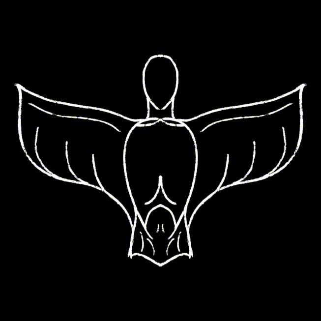
Unlike the majority of the design work that the collective has, largely under Ari's purview, this design started with a sketch in Procreate.
While generally speaking we as a collective strive to use open source software where we can, this is not a hard and fast rule. We believe it's important to decouple ideology from practice when it comes to accessibility and tool choice. Ultimately, Procreate was cheap when Emi bought it and continues to be one of the most simple design softwares she has to work with. It is vital to us that our members make the choices that feel best for their body/minds. Procreate continues to be worth the investment time and time again to Emi.
Once we had a sketched out idea of what we wanted to make, it was time for Ari & Emi to collaborate on the vectorization. Ari has been wanting to try out the new offering from Affinity (previously Affinity Designer), especially since it moved to a “forever free” release in partnership with Canva. Ultimately, we aren't too happy with the AI shovelware being forced into the software, but we are glad to have all of our design needs in one place. None of us had ever worked with Affinity's vector graphics offerings previously, but we found it relatively intuitive for the simple use case we had. The “jury” is still out on the new software, but we will be sure to keep you – dear reader – posted!
Design Ethos
Emi's perspective
I had a number of goals and priorities going into this project, all centred in my best understanding of non-western/non-colonialist visual design language. It was important to me that this design represent my own journey in coming to understand myself as a person of metís and indigenous heritage. I wanted to go about this design in a good way that honoured not only this heritage, but the privilege I hold in being able to go until later in life without knowing about it. Therefore, I avoided using any specific design elements, and instead focused on a vague merger of organic geometry and fluid brush-strokes.
Furthermore, the iconography of a crow has many meanings both for the collective as a whole and me specifically. Corvids are incredibly loyal to those who treat them with respect. We've all heard stories of corvids and crows bringing gifts and trinkets to people who treat them like the friends they are. Crows and corvids aren't just smart, they exhibit a wisdom I feel we could all learn from. Crows are regularly observed utilizing their environments to create tools and manipulating them to their own benefit. Crows carefully plan ways to better their surroundings, building community with even those beings completely unlike them.
Collective perspective
We as a collective chose crows to embody our ethos because of their resourcefulness. A bird often associated with death and decay, crows are vital to their respective ecosystems. Crows build partnerships, design systems, and exist within their environments – not despite them. We value these traits. As a collective it is our goal to slowly foster liberationary relationship building both with those we engage with through our work and as an ethos and way of being for all.
The fluid brush strokes of the piece complement our values of natural and sustainable growth. By being free to travel where they want to go, not where they would be expected to go. As a crip/mad collective, we wanted our logo to represent the ways in which our lives must remain ever in flux – waxing and waning with the tides of our symptoms. Where a more traditional design may stray away from fluid/thin lines for readability sake, we wanted to explore just how much we could get away with.
We had very few “requirements” that we reached as a consensus, and one of the only ones was the use of organic geometry. We felt that straight lines and hard angles were antithetical to the queer weirdness of our lives. Hell, it says it on the tin: “straight lines” just aren't something we are very good at. Emi did a fantastic job on this front.
![]()
As always with all of our works, we intend on revising and revisiting this design as time goes on. Emi is a perfectionist after all! For now, expect to see it tossed in where we can!